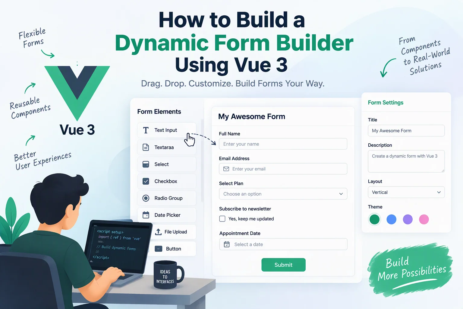
A dynamic form builder allows users to create, customize, and manage forms without writing code. Instead of developing a separate form for every business requirement, organizations can use a visual interface to add fields, configure validation rules, arrange layouts, and publish forms.
Businesses use dynamic form builders for customer registrations, employee onboarding, surveys, feedback collection, application forms, booking requests, and internal data collection. Building one with Vue 3 provides a flexible frontend architecture, reusable components, and reactive state management.
In this guide, we will explore how to build a dynamic form builder using Vue 3, including its architecture, essential features, component structure, form configuration, validation, data storage, and deployment.
1. Define the Core Features
Before starting development, identify the features required for the form builder.
| Feature | Description |
|---|---|
| Drag-and-drop editor | Add and rearrange form fields visually |
| Field library | Provide text, email, number, date, dropdown, checkbox, and other field types |
| Field configuration | Customize labels, placeholders, options, and required status |
| Dynamic validation | Configure validation rules for individual fields |
| Live preview | Display the form as users build it |
| Form settings | Configure titles, descriptions, and submission behavior |
| Form publishing | Generate a shareable form URL |
| Response management | Store, view, and export submitted responses |
| Form editing | Update previously created forms |
The first version should focus on field creation, configuration, preview, validation, and submission. Advanced capabilities can be added later.
2. Choose the Technology Stack
Vue 3 provides the reactive foundation for the form builder. Additional technologies can support routing, state management, drag-and-drop interactions, and backend communication.
| Technology | Purpose |
|---|---|
| Vue 3 | Build the user interface |
| Composition API | Organize reusable component logic |
| TypeScript | Improve type safety |
| Pinia | Manage form builder state |
| Vue Router | Handle editor, preview, and response pages |
| Vue Draggable | Implement drag-and-drop functionality |
| VeeValidate | Manage form validation |
| Zod | Define validation schemas |
| Axios | Communicate with backend APIs |
| Node.js | Develop backend services |
| PostgreSQL | Store forms and submissions |
The exact stack can vary depending on application complexity and hosting requirements.
3. Set Up the Vue 3 Project
Start by creating a Vue 3 project using Vite.
npm create vite@latest dynamic-form-builderSelect Vue and TypeScript during setup.
Install the required dependencies:
cd dynamic-form-builder

npm install
npm install pinia vue-router axios
npm install vuedraggable@next
npm install vee-validate zod
npm run dev
A possible project structure is:
src/
├── assets/
├── components/
│   ├── builder/
│   │   ├── FormCanvas.vue
│   │   ├── FieldLibrary.vue
│   │   ├── FieldSettings.vue
│   │   └── FormPreview.vue
│   ├── fields/
│   │   ├── TextField.vue
│   │   ├── EmailField.vue
│   │   ├── SelectField.vue
│   │   └── CheckboxField.vue
│   └── common/
├── stores/
│   └── formBuilder.ts
├── views/
│   ├── DashboardView.vue
│   ├── BuilderView.vue
│   ├── PreviewView.vue
│   └── ResponsesView.vue
├── services/
│   └── formService.ts
├── router/
│   └── index.ts
├── types/
│   └── form.ts
├── App.vue
└── main.ts
This structure separates field components, builder functionality, application state, and API communication.
4. Define a Dynamic Form Data Structure
A dynamic form builder should store its configuration as structured data rather than hardcoding every form.
Each field needs a unique identifier, type, label, and configuration.
For example:
export interface FormField {
  id: string;
  type: string;
  label: string;
  name: string;
  placeholder?: string;
  required: boolean;
  options?: string[];
  validation?: {
    minLength?: number;
    maxLength?: number;
    min?: number;
    max?: number;
  };
}

export interface DynamicForm {
  id: string;
  title: string;
  description: string;
  fields: FormField[];
}
A sample form configuration could look like this:
const form: DynamicForm = {
  id: "form-001",
  title: "Customer Registration",
  description: "Complete the registration form.",
  fields: [
    {
      id: "field-001",
      type: "text",
      label: "Full Name",
      name: "fullName",
      placeholder: "Enter your name",
      required: true
    },
    {
      id: "field-002",
      type: "email",
      label: "Email Address",
      name: "email",
      placeholder: "Enter your email",
      required: true
    }
  ]
};
This structure makes it possible to save, retrieve, edit, and render forms dynamically.
5. Create a Field Library
The field library provides users with the available form elements.
Common field types include:
- Short text
- Long text
- Phone number
- Number
- Date and time
- Dropdown
- Radio buttons
- Checkboxes
- File upload
- URL
- Section heading
Create a reusable field library component.
<script setup lang="ts">
const fieldTypes = [
  { type: "text", label: "Short Text" },
  { type: "textarea", label: "Long Text" },
  { type: "email", label: "Email" },
  { type: "number", label: "Number" },
  { type: "date", label: "Date" },
  { type: "select", label: "Dropdown" },
  { type: "checkbox", label: "Checkbox" }
];

const emit = defineEmits(["add-field"]);
</script>

<template>
  <div class="field-library">
    <h3>Form Elements</h3>

    <button
      v-for="field in fieldTypes"
      :key="field.type"
      @click="emit('add-field', field.type)"
    >
      {{ field.label }}
    </button>
  </div>
</template>
When a user selects a field type, the component sends an event to the main builder.
6. Implement the Form Builder Canvas
The canvas is the main workspace where users arrange and configure form fields.
It should support:
- Adding new fields
- Selecting existing fields
- Rearranging fields
- Removing fields
- Editing field properties
Vue Draggable can provide drag-and-drop functionality.
Example:
<script setup lang="ts">
import draggable from "vuedraggable";
import { useFormBuilderStore } from "@/stores/formBuilder";

const store = useFormBuilderStore();
</script>

<template>
  <div class="form-canvas">
    <h2>{{ store.form.title }}</h2>

    <draggable
      v-model="store.form.fields"
      item-key="id"
      handle=".drag-handle"
    >
      <template #item="{ element }">
        <div
          class="form-field"
          @click="store.selectField(element.id)"
        >
          <span class="drag-handle">☰</span>
          <strong>{{ element.label }}</strong>
          <small>{{ element.type }}</small>
        </div>
      </template>
    </draggable>
  </div>
</template>
The selected field can be displayed in a settings panel for further customization.
For production use, also implement keyboard-accessible field reordering and clear selection indicators.
7. Manage Form State with Pinia
Pinia provides centralized state management for the form builder.
It allows different components to access and update the same form configuration.
Create a store:
import { defineStore } from "pinia";
import type { DynamicForm, FormField } from "@/types/form";

export const useFormBuilderStore = defineStore(
  "formBuilder",
  {
    state: () => ({
      form: {
        id: "form-001",
        title: "Untitled Form",
        description: "",
        fields: [] as FormField[]
      } as DynamicForm,

      selectedFieldId: null as string | null
    }),

    actions: {
      addField(type: string) {
        const field: FormField = {
          id: crypto.randomUUID(),
          type,
          label: `New ${type} Field`,
          name: `field_${Date.now()}`,
          required: false
        };

        this.form.fields.push(field);
      },

      selectField(id: string) {
        this.selectedFieldId = id;
      },

      removeField(id: string) {
        this.form.fields =
          this.form.fields.filter(field => field.id !== id);

        if (this.selectedFieldId === id) {
          this.selectedFieldId = null;
        }
      }
    }
  }
);
The store can later include actions for updating field properties, saving forms, duplicating fields, and managing multiple forms.
8. Build the Field Configuration Panel
Users need control over how individual fields behave and appear.
For example, selecting an email field should allow users to edit:
- Field label
- Field name
- Placeholder
- Required status
- Default value
- Validation rules
- Help text
The configuration panel should update the selected field directly through the Pinia store.
For dropdown fields, users should also be able to add, edit, remove, and reorder options.
A useful design separates general settings from advanced validation settings so that the editor remains easy to understand.
9. Render Forms Dynamically
The form renderer converts saved configuration into actual input elements.
Instead of writing separate forms for every business requirement, use reusable components.
Example:
<script setup lang="ts">
import type { FormField } from "@/types/form";

defineProps<{
  field: FormField;
}>();

const model = defineModel<string | number | boolean>();
</script>

<template>
  <div class="dynamic-field">
    <label :for="field.id">
      {{ field.label }}
      <span v-if="field.required">*</span>
    </label>

    <input
      v-if="['text', 'email', 'number', 'date'].includes(field.type)"
      :id="field.id"
      :type="field.type"
      :name="field.name"
      :placeholder="field.placeholder"
      :required="field.required"
      v-model="model"
    />

    <textarea
      v-else-if="field.type === 'textarea'"
      :id="field.id"
      :name="field.name"
      :placeholder="field.placeholder"
      :required="field.required"
      v-model="model"
    />

    <select
      v-else-if="field.type === 'select'"
      :id="field.id"
      :name="field.name"
      :required="field.required"
      v-model="model"
    >
      <option
        v-for="option in field.options || []"
        :key="option"
        :value="option"
      >
        {{ option }}
      </option>
    </select>
  </div>
</template>
For a complete implementation, use dedicated components for radio buttons, checkbox groups, file uploads, and other specialized field types.
10. Implement Dynamic Form Validation
Validation helps prevent incomplete or incorrect submissions.
The form builder should support configurable rules such as:
| Field Type | Validation |
|---|---|
| Text | Required, minimum length, maximum length |
| Valid email format | |
| Number | Minimum and maximum value |
| Phone | Configurable phone number format |
| Dropdown | Required selection |
| File | File type and size restrictions |
| Date | Valid date and permitted date range |
For example, a form configuration might define:
{
  "type": "text",
  "label": "Full Name",
  "required": true,
  "validation": {
    "minLength": 3,
    "maxLength": 50
  }
}
The renderer should convert these settings into validation rules.
Use VeeValidate and Zod where appropriate to manage complex validation logic. Validation must also run on the backend because client-side checks can be bypassed.
11. Add Live Form Preview
A live preview allows users to see how their form will appear before publishing it.
The preview should display the same configuration used by the editor but without editing controls.
Useful preview capabilities include:
- Desktop and mobile layouts
- Input field rendering
- Required-field indicators
- Validation messages
- Submit button behavior
- Form title and description
Keep the preview synchronized with the builder state so that changes appear immediately.
12. Design the Backend and Database
A production-ready dynamic form builder requires backend services to save form configurations and collect submissions.
A Node.js backend can expose REST APIs for form management and response processing.
Suggested database tables:
| Table | Important Fields |
|---|---|
| users | id, name, email, password_hash |
| forms | id, user_id, title, description, status |
| form_versions | id, form_id, version, schema_json |
| submissions | id, form_id, submitted_at |
| submission_answers | id, submission_id, field_id, answer_json |
Store form configuration in a JSON-compatible column such as PostgreSQL JSONB, while keeping submissions and ownership relationships properly structured.
The backend should validate form ownership, published status, field definitions, and submission data before accepting responses.
13. Develop REST API Endpoints
The frontend needs APIs to manage forms and submissions.
| Method | Endpoint | Purpose |
|---|---|---|
| POST | /api/forms | Create a form |
| GET | /api/forms | List forms |
| GET | /api/forms/:id | Retrieve a form |
| PUT | /api/forms/:id | Update a form |
| DELETE | /api/forms/:id | Delete a form |
| POST | /api/forms/:id/publish | Publish a form |
| GET | /api/public/forms/:id | Retrieve a published form |
| POST | /api/public/forms/:id/submit | Submit a response |
| GET | /api/forms/:id/submissions | Retrieve responses |
Use authentication for private form management endpoints. Public submission endpoints should have appropriate rate limits, spam protection, and server-side validation.
14. Add Form Publishing and Sharing
Once a form is complete, users should be able to publish it and share it with others.
Possible publishing options include:
- Public form URL
- Website embedding
- QR code
- Email sharing
- Access-controlled forms
For example:
https://example.com/forms/customer-registrationThe public form page should load the published form configuration from the backend.
A useful feature is version management. When a published form is edited, the system should preserve existing submissions and define how older versions are handled.
15. Implement Security and Data Protection
Forms can collect personal and business information, so security should be part of the initial architecture.
Important security measures include:
- Use secure authentication and role-based access control.
- Validate and sanitize submitted data on the backend.
- Restrict uploaded file types and sizes.
- Store passwords using secure password hashing.
- Use HTTPS for all application communication.
- Apply rate limiting and spam prevention.
- Protect against cross-site scripting and injection attacks.
- Encrypt sensitive data where appropriate.
- Maintain audit logs for important administrative actions.
- Define data retention and deletion policies.
If forms collect personal information, implement appropriate consent, privacy notices, and data-handling practices for the markets in which the application operates.
16. Test and Deploy the Application
Before launching the form builder, test the editor, renderer, validation system, and backend workflows.
| Testing Area | What to Verify |
|---|---|
| Component testing | Individual field components work correctly |
| Form builder testing | Adding, editing, deleting, and reordering fields |
| Validation testing | Required and custom validation rules |
| API testing | Form creation, updates, publishing, and submissions |
| Security testing | Authentication, authorization, and input handling |
| Responsive testing | Editor and forms work on mobile and desktop |
| Performance testing | Large forms render and respond efficiently |
Deploy the Vue frontend to a suitable hosting platform and the backend to an environment that supports the required API and database services.
Use environment variables for API endpoints and secrets. Configure production logging, monitoring, database backups, and error reporting.
17. Advanced Features to Add Later
After the core form builder is stable, additional features can make it more useful for businesses.
- Conditional logic to show or hide fields based on previous answers
- Multi-page forms with progress indicators
- Reusable form templates
- Team collaboration and permissions
- Form analytics and completion reports
- Email notifications after submissions
- Webhook integrations
- PDF generation
- Electronic signatures
- AI-assisted form creation
- Third-party CRM and business application integrations
These capabilities can help transform a basic form editor into a complete business form management platform.
Conclusion
Building a dynamic form builder using Vue 3 involves more than creating input fields. It requires a flexible form schema, reusable field components, drag-and-drop editing, centralized state management, dynamic validation, backend APIs, and secure response storage.
Vue 3, TypeScript, Pinia, and a suitable backend provide a practical foundation for developing this type of application. By starting with essential form-building features and gradually adding advanced capabilities, businesses can create a scalable platform for collecting and managing information.
Looking to build a custom dynamic form builder or business form management platform? Dotcube Technologies can help design and develop software tailored to your business requirements.
Contact Dotcube Technologies: https://www.dotcubetechnologies.com/#contact