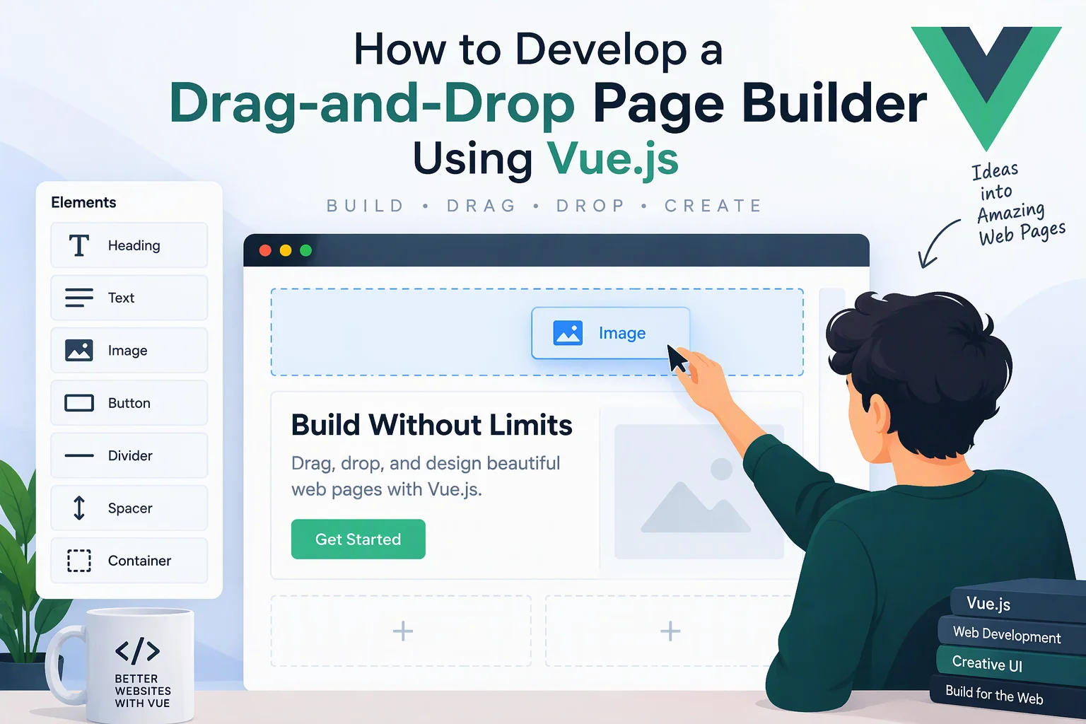
A drag-and-drop page builder allows users to create and customize web pages without writing HTML, CSS, or JavaScript manually. Instead of depending on developers for every layout change, users can add content blocks, arrange elements, customize styles, and preview pages through a visual editor.
Businesses use page builders to create landing pages, marketing websites, product pages, portfolio layouts, and other web content. Developing one with Vue.js provides a flexible foundation for building interactive editing experiences with reusable components and reactive state management.
In this guide, we will explore how to develop a drag-and-drop page builder using Vue.js, including its architecture, component system, drag-and-drop functionality, styling controls, page rendering, backend integration, and deployment.
1. Define the Core Features
Start by identifying the features required for the page builder.
| Feature | Description |
|---|---|
| Component library | Provides reusable elements such as headings, images, buttons, and containers |
| Drag-and-drop editor | Allows users to move elements onto the page canvas |
| Visual page canvas | Displays the page while users build it |
| Property editor | Customizes content, dimensions, colors, and typography |
| Responsive editing | Supports desktop, tablet, and mobile layouts |
| Layer management | Displays the hierarchy of page elements |
| Undo and redo | Reverses or restores editing actions |
| Live preview | Shows the page without editor controls |
| Page templates | Provides ready-made layouts |
| Save and publish | Stores page configurations and publishes completed pages |
For the first release, prioritize component management, drag-and-drop editing, property customization, responsive preview, and page saving.
2. Choose the Technology Stack
Vue.js provides the reactive interface needed for the visual editor. Additional tools help manage application state, routing, drag-and-drop interactions, and backend communication.
| Technology | Purpose |
|---|---|
| Vue 3 | Build the page builder interface |
| Composition API | Organize reusable application logic |
| TypeScript | Define page and component structures |
| Pinia | Manage editor state |
| Vue Router | Manage editor, preview, and dashboard pages |
| Vue Draggable | Implement drag-and-drop interactions |
| Axios | Communicate with backend APIs |
| Node.js | Build backend services |
| PostgreSQL | Store pages, users, and publishing information |
| JSONB | Store flexible page configuration data |
For more advanced editors, a dedicated drag-and-drop framework or custom pointer-based interaction system may be preferable.
3. Set Up the Vue.js Project
Create a new Vue 3 project using Vite.
npm create vite@latest vue-page-builderSelect Vue and TypeScript during project setup.
Install the required dependencies:
cd vue-page-builder

npm install
npm install pinia vue-router axios
npm install vuedraggable@next

npm run dev
A recommended project structure is:
src/
├── components/
│   ├── editor/
│   │   ├── EditorToolbar.vue
│   │   ├── PageCanvas.vue
│   │   ├── ComponentLibrary.vue
│   │   ├── PropertiesPanel.vue
│   │   └── LayersPanel.vue
│   ├── blocks/
│   │   ├── HeadingBlock.vue
│   │   ├── TextBlock.vue
│   │   ├── ImageBlock.vue
│   │   ├── ButtonBlock.vue
│   │   └── ContainerBlock.vue
│   └── common/
├── stores/
│   └── pageBuilder.ts
├── views/
│   ├── DashboardView.vue
│   ├── EditorView.vue
│   └── PreviewView.vue
├── services/
│   └── pageService.ts
├── types/
│   └── page.ts
├── router/
│   └── index.ts
├── App.vue
└── main.ts
This structure separates the visual editor, reusable page components, application state, and backend services.
4. Design the Page Builder Architecture
A page builder should separate the editing interface from the actual page content.
A practical architecture contains four main parts:
- Component Library: Provides available page elements.
- Editor Canvas: Displays and organizes selected components.
- Properties Panel: Allows users to configure selected elements.
- Page Renderer: Converts saved page configuration into a published web page.
The overall workflow looks like this:
        Vue.js Page Builder
                |
       +--------+--------+
       |        |        |
   Component  Editor  Properties
    Library   Canvas    Panel
       |        |        |
       +--------+--------+
                |
         Pinia State Store
                |
         Page Configuration
             (JSON)
                |
          Backend API
                |
           Database
                |
          Page Renderer
                |
          Published Page
The important principle is to store page content as structured data rather than saving the editor’s entire HTML output.
5. Define a Reusable Page Component Structure
Every element in the page builder should have a consistent data structure.
For example, a heading block might contain:
- Unique component ID
- Component type
- Text content
- Font size
- Font weight
- Text color
- Alignment
- Spacing settings
Create TypeScript interfaces:
export interface PageBlock {
  id: string;
  type: string;
  content: Record<string, unknown>;
  styles: Record<string, string | number>;
  children?: PageBlock[];
}

export interface BuilderPage {
  id: string;
  title: string;
  slug: string;
  blocks: PageBlock[];
}
A sample page configuration:
const page: BuilderPage = {
  id: "page-001",
  title: "Business Landing Page",
  slug: "business-landing-page",
  blocks: [
    {
      id: "block-001",
      type: "heading",
      content: {
        text: "Welcome to Our Website"
      },
      styles: {
        fontSize: "36px",
        color: "#222222",
        textAlign: "center"
      }
    },
    {
      id: "block-002",
      type: "button",
      content: {
        text: "Get Started",
        url: "/contact"
      },
      styles: {
        backgroundColor: "#2563eb",
        color: "#ffffff"
      }
    }
  ]
};
This approach makes pages easier to edit, duplicate, save, and render.
6. Build the Component Library
The component library provides users with elements they can add to the page.
Common components include:
| Component Category | Available Elements |
|---|---|
| Basic elements | Heading, paragraph, image, button, divider |
| Layout elements | Container, row, column, grid, spacer |
| Media elements | Video, gallery, background image |
| Interactive elements | Accordion, tabs, carousel |
| Marketing elements | Hero section, testimonials, pricing table, CTA |
| Advanced elements | Custom HTML block, embedded content |
Create a reusable component library:
<script setup lang="ts">
const components = [
  { type: "heading", label: "Heading" },
  { type: "text", label: "Text" },
  { type: "image", label: "Image" },
  { type: "button", label: "Button" },
  { type: "container", label: "Container" }
];

const emit = defineEmits(["add-component"]);
</script>

<template>
  <div class="component-library">
    <h3>Elements</h3>

    <button
      v-for="component in components"
      :key="component.type"
      @click="emit('add-component', component.type)"
    >
      {{ component.label }}
    </button>
  </div>
</template>
Users should be able to add elements by dragging them onto the canvas or selecting them from the library.
7. Implement Drag-and-Drop Functionality
Drag-and-drop functionality is the central feature of a visual page builder.
Vue Draggable can help users rearrange existing elements and transfer components between compatible lists.
Example canvas implementation:
<script setup lang="ts">
import draggable from "vuedraggable";
import { usePageBuilderStore } from "@/stores/pageBuilder";

const store = usePageBuilderStore();
</script>

<template>
  <div class="page-canvas">
    <draggable
      v-model="store.page.blocks"
      item-key="id"
      group="page-blocks"
      handle=".drag-handle"
    >
      <template #item="{ element }">
        <div
          class="canvas-block"
          @click="store.selectBlock(element.id)"
        >
          <span class="drag-handle">☰</span>
          <strong>{{ element.type }}</strong>
        </div>
      </template>
    </draggable>
  </div>
</template>
For a complete editor, implement the following interactions:
- Drag new components from the library.
- Reorder existing components.
- Move elements between containers.
- Display insertion indicators.
- Prevent invalid nesting.
- Select and delete components.
- Support keyboard-based movement for accessibility.
For nested layouts, each container should have its own child component collection and valid drop zones. The editor must also distinguish between moving an existing block and creating a new instance.
8. Manage Editor State with Pinia
Pinia provides centralized state management for the page builder.
The store should manage:
- Current page configuration
- Selected component
- Component insertion and deletion
- Component updates
- Element ordering
- Undo and redo history
- Saving status
Example:
import { defineStore } from "pinia";
import type { BuilderPage, PageBlock } from "@/types/page";

export const usePageBuilderStore = defineStore(
  "pageBuilder",
  {
    state: () => ({
      page: {
        id: "page-001",
        title: "Untitled Page",
        slug: "untitled-page",
        blocks: []
      } as BuilderPage,

      selectedBlockId: null as string | null
    }),

    actions: {
      addBlock(type: string) {
        const block: PageBlock = {
          id: crypto.randomUUID(),
          type,
          content: {},
          styles: {}
        };

        this.page.blocks.push(block);
      },

      selectBlock(id: string) {
        this.selectedBlockId = id;
      },

      removeBlock(id: string) {
        this.page.blocks =
          this.page.blocks.filter(block => block.id !== id);

        if (this.selectedBlockId === id) {
          this.selectedBlockId = null;
        }
      }
    }
  }
);
For nested components, update the store actions to locate blocks recursively rather than operating only on the top-level array.
9. Develop the Properties Panel
The properties panel allows users to customize selected page elements without directly editing code.
For a heading component, users may need to configure:
- Text content
- Heading level
- Font family
- Font size
- Font weight
- Text color
- Text alignment
- Margin and padding
For an image component, the settings may include:
- Image URL or upload
- Alternative text
- Width and height
- Image fit
- Border radius
- Alignment
- Link destination
For buttons, users may configure labels, links, colors, border styles, and hover effects.
Keep the properties panel component-specific. Showing irrelevant settings for every element can make the editor difficult to use.
10. Build a Dynamic Page Renderer
The page renderer converts the saved page configuration into a real web page.
Create a component registry that maps block types to Vue components.
For example:
import HeadingBlock from "@/components/blocks/HeadingBlock.vue";
import TextBlock from "@/components/blocks/TextBlock.vue";
import ImageBlock from "@/components/blocks/ImageBlock.vue";
import ButtonBlock from "@/components/blocks/ButtonBlock.vue";

export const blockRegistry = {
  heading: HeadingBlock,
  text: TextBlock,
  image: ImageBlock,
  button: ButtonBlock
};
Render the configured components dynamically:
<script setup lang="ts">
import { blockRegistry } from "@/components/blockRegistry";
import type { PageBlock } from "@/types/page";

defineProps<{
  blocks: PageBlock[];
}>();
</script>

<template>
  <component
    v-for="block in blocks"
    :key="block.id"
    :is="blockRegistry[block.type as keyof typeof blockRegistry]"
    :block="block"
  />
</template>
Each registered component should accept a consistent block prop and render its content and styles.
In production, validate block types before rendering and avoid allowing arbitrary untrusted HTML or JavaScript.
11. Add Responsive Design Controls
Modern websites must work across different screen sizes.
A page builder should provide responsive editing options for:
- Desktop
- Tablet
- Mobile
Users should be able to configure different styles for each breakpoint.
For example:
const responsiveStyles = {
  desktop: {
    fontSize: "40px",
    padding: "40px"
  },
  tablet: {
    fontSize: "32px",
    padding: "24px"
  },
  mobile: {
    fontSize: "24px",
    padding: "16px"
  }
};
The page renderer can translate these settings into responsive CSS classes or media queries.
Also provide viewport preview controls so users can inspect layouts without changing their actual device settings.
12. Implement Undo and Redo
Users frequently make changes while designing pages. Undo and redo functionality helps them recover from unwanted modifications.
Maintain a history of page configurations:
interface EditorHistory {
  past: BuilderPage[];
  present: BuilderPage;
  future: BuilderPage[];
}
Whenever a meaningful change occurs, store a snapshot of the previous configuration.
- Undo restores the previous snapshot.
- Redo restores the next snapshot.
- New changes after undo clear the redo history.
For large pages, consider using command-based history or state patches instead of copying the entire page configuration after every small change.
13. Design the Backend and Database
The backend manages page configurations, user permissions, publishing, and content storage.
A Node.js backend can expose REST APIs to support the editor.
Suggested database structure:
| Table | Important Fields |
|---|---|
| users | id, name, email, password_hash |
| pages | id, user_id, title, slug, status |
| page_versions | id, page_id, version, content_json |
| media_assets | id, user_id, file_url, file_type |
| page_permissions | id, page_id, user_id, role |
| publishing_logs | id, page_id, published_at, version_id |
Use PostgreSQL with JSONB to store flexible page configuration. Keep ownership, permissions, publishing information, and version history in structured relational tables.
Media files should generally be stored in object storage rather than directly inside the page configuration.
14. Develop REST API Endpoints
The Vue.js frontend communicates with backend services to manage pages.
| Method | Endpoint | Purpose |
|---|---|---|
| POST | /api/pages | Create a page |
| GET | /api/pages | List pages |
| GET | /api/pages/:id | Retrieve page configuration |
| PUT | /api/pages/:id | Update page content |
| DELETE | /api/pages/:id | Delete a page |
| POST | /api/pages/:id/duplicate | Duplicate a page |
| POST | /api/pages/:id/publish | Publish a page |
| GET | /api/public/pages/:slug | Retrieve a published page |
| POST | /api/media/upload | Upload media files |
Protect editing APIs with authentication and authorization. Public page endpoints should return only published content.
15. Implement Page Publishing
After completing a page, users should be able to publish it.
A publishing workflow can include:
- Validate the page configuration.
- Check that all referenced components are supported.
- Validate media URLs and required content.
- Save a version of the page.
- Generate or update its public URL.
- Make the published version available to visitors.
Example:
https://example.com/pages/business-landing-pageFor a production platform, consider versioned publishing so users can edit a draft without immediately changing the live page.
Also support custom domains, SEO metadata, social sharing images, and page redirects when required.
16. Focus on Security and Performance
A page builder may allow users to upload files, add links, and create public pages. These features require appropriate security controls.
Important practices include:
- Authenticate users and enforce page ownership.
- Validate all saved page configurations on the backend.
- Sanitize user-generated content.
- Avoid executing arbitrary user-provided JavaScript.
- Restrict file types and upload sizes.
- Use secure media storage and access permissions.
- Protect APIs with rate limiting.
- Apply Content Security Policy where appropriate.
- Keep dependencies updated.
- Maintain backups and publishing logs.
For performance, lazy-load media, use efficient component rendering, avoid unnecessary reactive updates, and consider virtualization for pages containing many editor elements.
17. Test and Deploy the Page Builder
Before launch, test both the editing experience and the published output.
| Testing Area | What to Verify |
|---|---|
| Component testing | Individual blocks render correctly |
| Drag-and-drop testing | Components can be added, moved, and reordered |
| State management | Changes remain consistent across editor panels |
| Responsive testing | Layouts work on desktop, tablet, and mobile |
| API testing | Page creation, updates, and publishing work correctly |
| Security testing | User permissions and uploaded content are protected |
| Performance testing | Large pages remain responsive |
| Browser testing | Editor works across supported browsers |
Deploy the Vue.js frontend and backend to suitable hosting environments. Configure production environment variables, HTTPS, database backups, error monitoring, and media storage.
18. Advanced Features to Add Later
Once the core page builder is working, introduce advanced capabilities to improve its usefulness.
- Ready-made website and landing page templates
- Nested sections and reusable global components
- Copy and paste between pages
- Collaborative editing
- Revision history and version comparison
- Custom CSS controls
- Animation and interaction settings
- SEO metadata editor
- Custom domain management
- AI-assisted page generation
- Third-party integrations
- Website analytics and performance reports
These features can turn a basic visual editor into a complete website creation platform.
Conclusion
Developing a drag-and-drop page builder using Vue.js requires a combination of reusable components, interactive editing tools, structured page configuration, responsive styling, state management, and backend services.
Vue 3, TypeScript, Pinia, and a suitable drag-and-drop solution provide a strong foundation for building a visual page editor. By separating the editing interface from the page renderer and storing layouts as structured data, developers can create a flexible platform that supports customization, publishing, and future expansion.
Looking to build a custom drag-and-drop page builder or visual website creation platform? Dotcube Technologies can help design and develop software tailored to your business requirements.
Contact Dotcube Technologies: https://www.dotcubetechnologies.com/#contact